 Lorena G.
When it comes to designing impactful trade show booths, your graphics play a crucial role in catching the eyes of attendees and conveying your brand message.
These visuals do more than just decorate your space; they are a vital component of your overall marketing strategy.
From what I have seen, investing time and effort into creating compelling graphics can significantly enhance booth engagement.
One of the first things to think about is your target audience.
Knowing who you’re speaking to allows you to tailor your graphics to their preferences and needs.
It’s surprising how often businesses overlook this aspect, but understanding the audience is paramount for effective communication.
This alignment of your graphics with your audience’s expectations makes all the difference in drawing people into your space.
Brand consistency is another area that I would say is non-negotiable for anyone serious about their trade show presence.
Branding across all marketing channels should be cohesive, making your message unmistakable.
When your booth graphics align with your overall brand, it not only enhances recall but also fosters trust among attendees.
A cohesive brand presentation feels like an extension of your business environment, reinforcing the promises you’re making to your customers.
Today, I want to walk you through six key considerations that can help you design trade show booth graphics that truly make an impact and create a lasting impression.
These practical tips focus on everything from knowing your audience to investing in quality materials.
Let’s unravel what it takes to transform your booth into a compelling visual experience.
- Understand target audience preferences before designing graphics.
- Incorporate brand colors and logos for consistency.
- Use bold, legible fonts for quick readability.
- Ensure graphics convey a clear and concise message.
- Opt for high-quality materials to enhance durability.
You’ll find more insight on connecting with your audience and making your booth stand out.
We’ll dig deeper into using colors and fonts that grab attention without overwhelming.
Learn about choosing materials that work best and leave a lasting impression.
These tips can make your graphics more effective and your booth more inviting.
1. Know Your Audience and Their Needs
When crafting your trade show booth graphics, the first thing that comes to mind should be your specific audience.
What we have seen work really well is when exhibitors tailor their graphics to appeal directly to their target market.
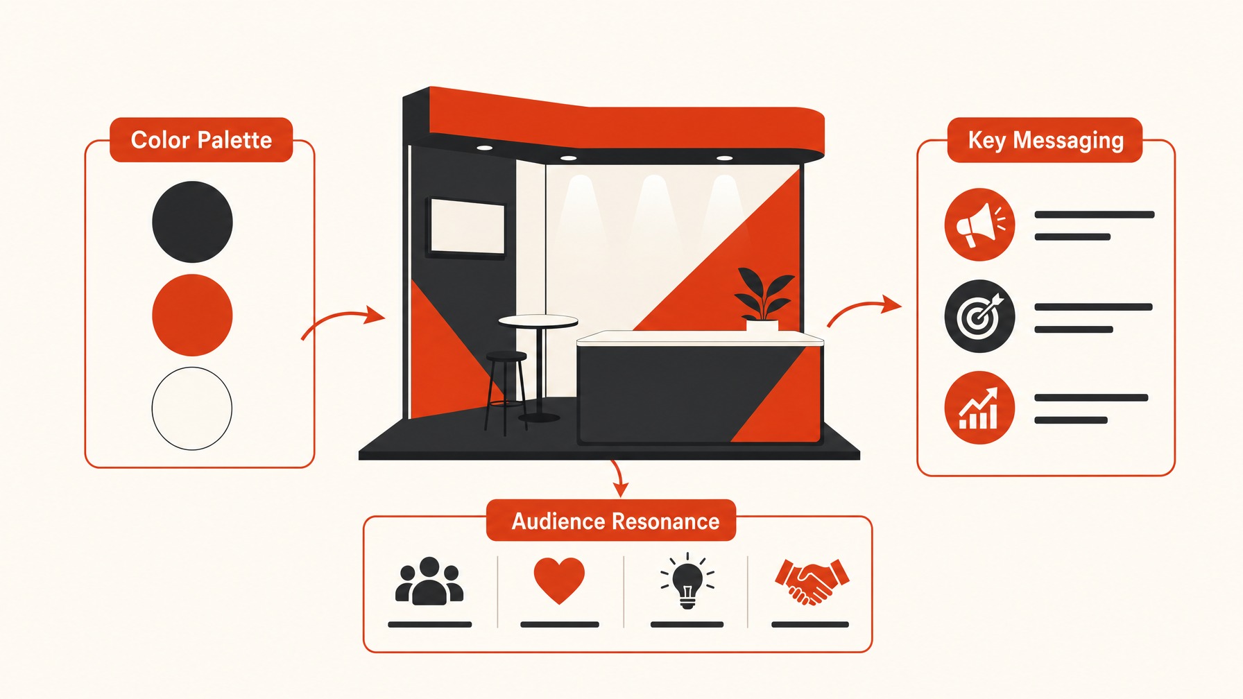
By understanding the demographic, industry, and pain points of the attendees, you can shape content that is not only relevant but also immediately engaging.
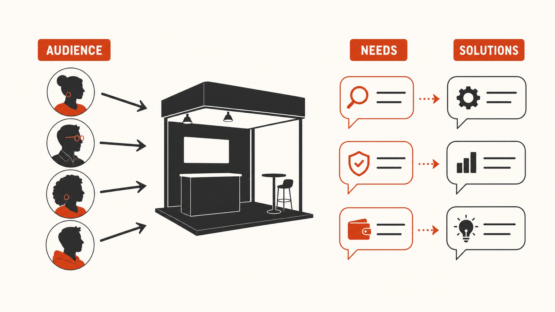
It’s critical to know what your audience is searching for and make sure that your booth messaging speaks to those needs in a meaningful way.
From what I have seen, the ones that get it right usually incorporate messaging that succinctly communicates how they can offer solutions or benefits directly addressing these needs.
Something that comes up a lot is the necessity to strike a balance between visual appeal and informative content.
Your graphics should not only be eye-catching but also clearly present what value or solution your company is providing.
What most exhibitors end up doing is relying on visually overloaded designs, which can often distract rather than attract.
I would say the biggest thing here is ensuring your visuals are not overwhelming and that any text is easy to digest quickly.
By doing this, you effectively connect with passing attendees’ needs and draw them into deeper conversations.
Additionally, considering the diversity of your audience can prompt the inclusion of varied elements to cater to different segments, enhancing your booth’s overall versatility and impact.
Remember, in the bustling environment of a trade show, your booth has just moments to capture attention, so every design choice should be intentional and audience-focused.
2. Prioritize Brand Consistency
One thing most exhibitors end up doing is underestimating the power of consistent branding when designing their trade show booth graphics.
This doesn’t simply mean plastering your logo everywhere, but rather maintaining a cohesive visual identity throughout your display.
Your graphics should reflect your brand’s core values, color scheme, typography, and overall aesthetic.
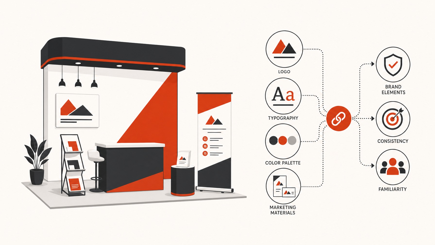
From what I have seen, the ones that get it right usually focus on ensuring their graphics communicate the same message and design style found in their other marketing materials.
This creates a familiar environment for returning customers and leaves a lasting impression on new attendees.
Having a branded booth that aligns with your other platforms can help build trust and recognition among your audience.
Here at Exhibitant, we tend to notice that companies who prioritize brand consistency across all channels have higher engagement rates at their booths.
The key is to present a unified image that attendees can easily associate with your brand, whether they see it in person or online. Think about how you can incorporate your brand’s elements into every graphic aspect, from the banner’s font to the backdrop‘s pattern.
Consistent branding is particularly important if you plan to use photography or videos within your booth’s design, as these elements should echo the same design principles.
One of the biggest things here is avoiding visual overload, which can dilute your brand message. By focusing on keeping your branding cohesive, you avoid conflicting design choices that might confuse or distract attendees.
Ultimately, brand consistency in your booth graphics not only strengthens your company’s identity but also enhances your overall trade show effectiveness.
Something that comes up a lot is how exhibitors can align their print and digital outputs for a smooth experience that feels both familiar and engaging. When your branding is consistent, it strengthens the connections attendees make between your visuals and your products or services.
3. Focus on Clarity and Readability
Clarity and readability are the cornerstones of effective trade show booth graphics, as they directly impact how your message is received by the audience. From what I have seen, exhibitors often face challenges ensuring their graphics are legible from a distance, particularly in crowded environments.
One thing most exhibitors end up doing is using a font size that’s too small or a font style that’s overly decorative, which can hinder readability.
It’s crucial to strike the right balance, using fonts that are bold and simple while maintaining an appropriate size to catch eyes even from afar.
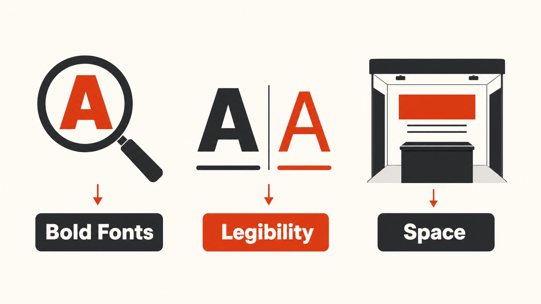
Allowing sufficient space between lines and avoiding clutter can significantly enhance the visual appeal of your display.
What we have seen work really well is the use of white space to draw focus to key messages without overwhelming the viewer. Another critical aspect is the contrast between the text and background color, which plays a pivotal role in readability.
Strong color contrast ensures that your text stands out and captures attention without straining the reader’s eyes.
We also notice that exhibitors who excel in this area typically embrace the 3-second rule where a passerby understands the main message within three seconds. Graphics should be clean, precise, and straightforward, allowing the audience to digest the information quickly.
Including only essential details and using bullet points effectively reduces information overload while maintaining clarity.
Keeping these elements in check ensures that your booth graphics communicate your message distinctly and leave an impression on potential leads.
 Louie J.