 Lorena G.
When preparing for a trade show, your booth graphics play a crucial role in capturing attention and projecting your brand’s message.
From what I’ve seen, ensuring your graphics meet artwork approval standards can make or break your display’s success.
It’s not just about looking good; it’s about meeting the specific guidelines and specifications required by the event organizers.
Something that comes up a lot is the importance of details, which can be the difference between smooth approval and stressful delays. I would say that understanding the nuances of artwork approval is essential for maintaining the integrity and professionalism of your brand.
Paying attention to this process not only helps in avoiding costly last-minute changes but also contributes to a smoother overall trade show experience.
Having well-designed booth graphics that meet these standards can significantly enhance your trade show presence, driving more foot traffic and engagement. It’s not just about grabbing attention on the day of the event; complying with these standards demonstrates respect for the event’s requirements, which often leads to better placement and opportunities at future shows.
Today, I want to cover some essential tips I’ve gathered over the years for meeting artwork approval standards in your trade show booth graphics.
Each tip is aimed at helping you navigate this often tricky part of the preparation process with greater confidence.
- Use high-resolution images for clear and sharp booth graphics.
- Ensure all text is legible from a distance.
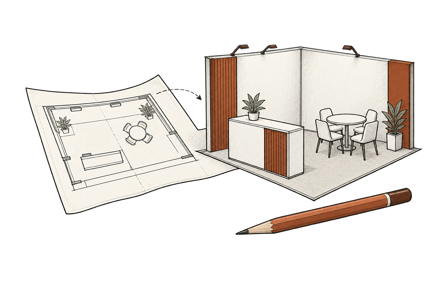
- Double-check dimensions to match artwork specifications.
- Adhere to branding guidelines consistently throughout.
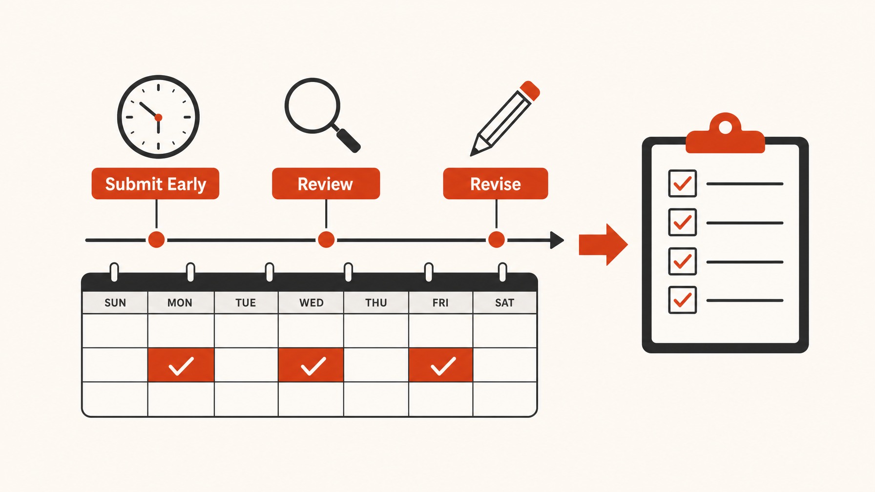
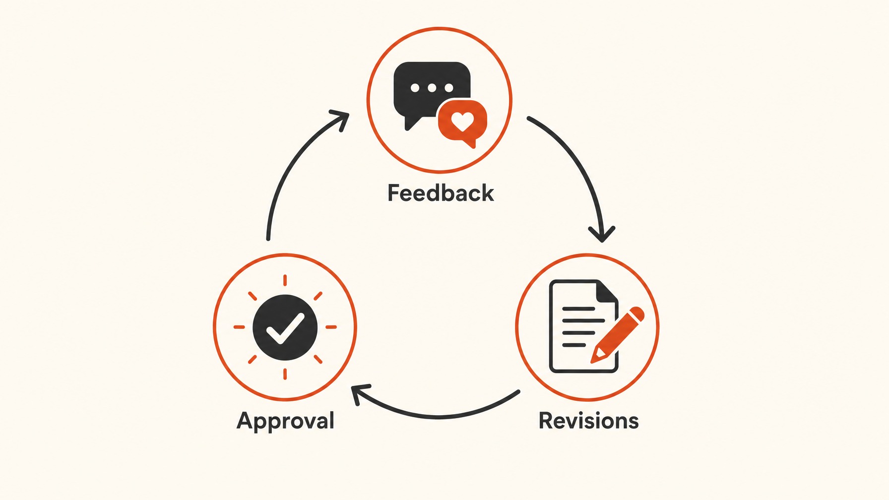
- Submit designs early to allow for revisions.
Make sure your booth has eye-catching graphics that make attendees remember your brand.
You might find that you need more than just a few basic tweaks, so it’s smart to know the right steps to take.
You’ll gain a deeper understanding and practical advice to guarantee your booth graphics meet approval standards.
Let’s make sure your booth stands out in the best way possible.
1. Choose High-Resolution Images
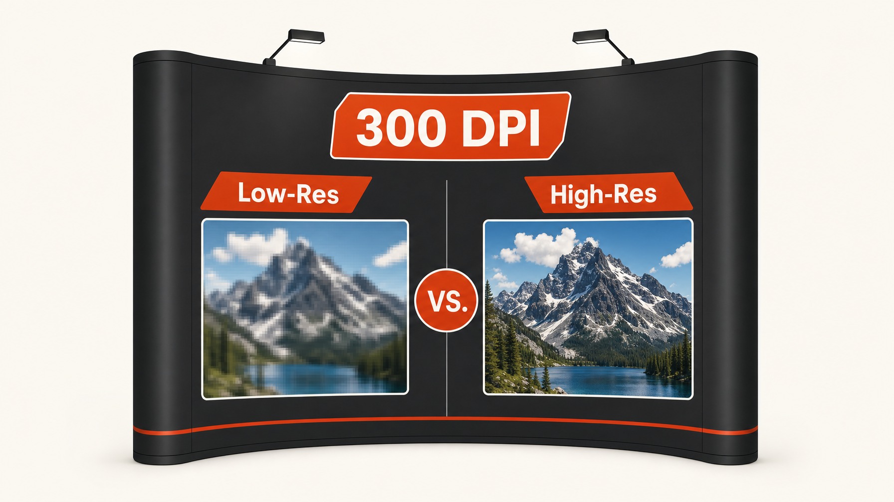
From my experience, the biggest mistake that happens with booth graphics is selecting images that are too low in resolution. High-resolution images are crucial because they make sure that your booth graphics look sharp and professional.
When you display an image on a large scale, any resolution issues become very apparent, which can tarnish the professional perception you aim to establish. Blurry or pixelated graphics can significantly diminish the impact of your overall booth presentation.
What I have seen work really well is always using images with at least 300 DPI to make sure optimal clarity in large formats.
One thing that often comes up is the challenge of sourcing high-resolution images, but investing in quality stock images or professional photography can really pay off in the long run.
It’s not just about having visuals that pop; it’s about conveying a strong brand message and image.
Without high-resolution graphics, attendees might walk away with a less than ideal impression.
It’s also important to consistently check with your designer or graphics team to confirm that all images meet the resolution requirements. If you’re working with a vendor, make sure they understand your quality standards and have access to properly-sized assets.
An investment in high-quality graphic design can act as the cornerstone of your booth strategy and significantly enhance your overall display effectiveness.
2. Prioritize Text Legibility
One of the core elements of any booth graphic is text, and what we have seen work really well is ensuring all text is immediately readable from a distance.
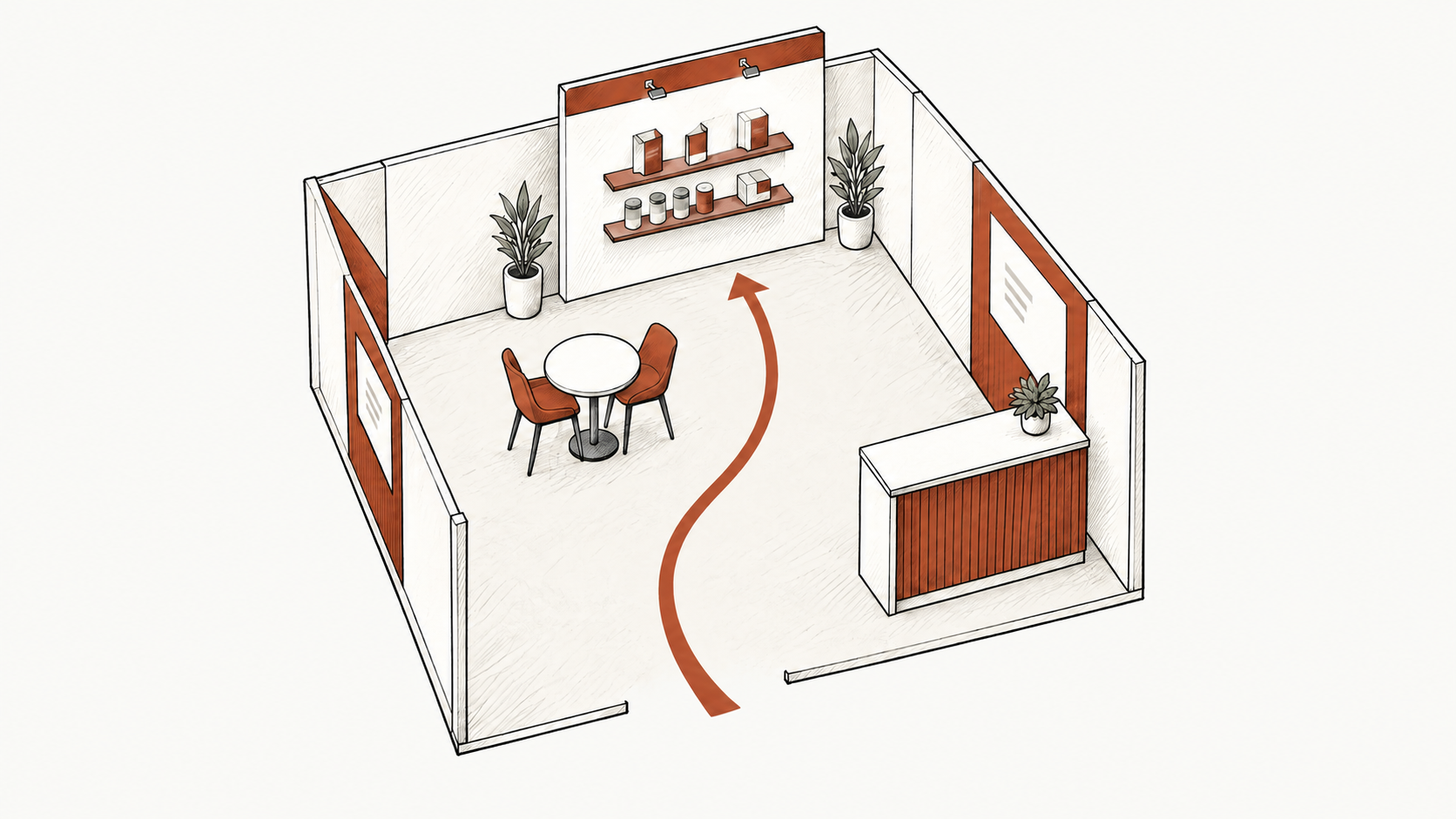
Getting the text size right is crucial, and it often requires an understanding of both the booth layout and how attendees navigate the space.
Exhibitors might be inclined to cram more information onto the graphic, but I would say the biggest thing here is to resist that temptation. Focusing on concise messaging not only ensures clarity but also enhances the overall aesthetic of the booth.
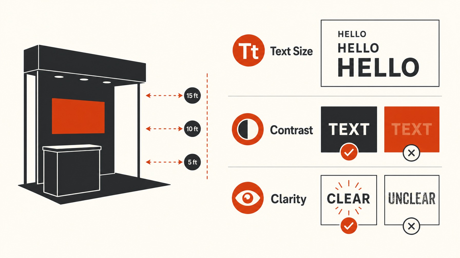
Here at Exhibitant, we have found that the use of contrasting colors can significantly boost text legibility, especially in a bustling exhibition environment. This technique involves selecting text and background colors that stand out from each other, which can make a noticeable difference in how your messaging is received.
Furthermore, choosing the right font plays a substantial role in making text more approachable and easier to scan.
Avoid overly decorative fonts that can distract or distort the message, sticking instead to clean, professional styles.
A tip that comes up a lot is to test your designs on different screen sizes or even print them at varying scales to gauge overall readability from different vantage points within the space.
This kind of proactive planning often heads off potential issues before they’re noticed by attendees during the live event.
By ensuring text is legible at various distances and angles, you’ll effectively support your main goal: efficiently communicating your message to a diverse audience. Last but not least, get everybody on your team to weigh in on readability, as a fresh set of eyes can often spot something you might have missed.
3. Verify Correct Dimensions
From what I have seen, the ones that get it right usually start with verifying the correct dimensions for their booth graphics.
This step is crucial because incorrect sizing can lead to distorted images, misplaced text, or worse, having no art at all where it’s needed.
Before sending your files to print, cross-check the dimensions specified in the exhibit guidelines with the files you have on hand.
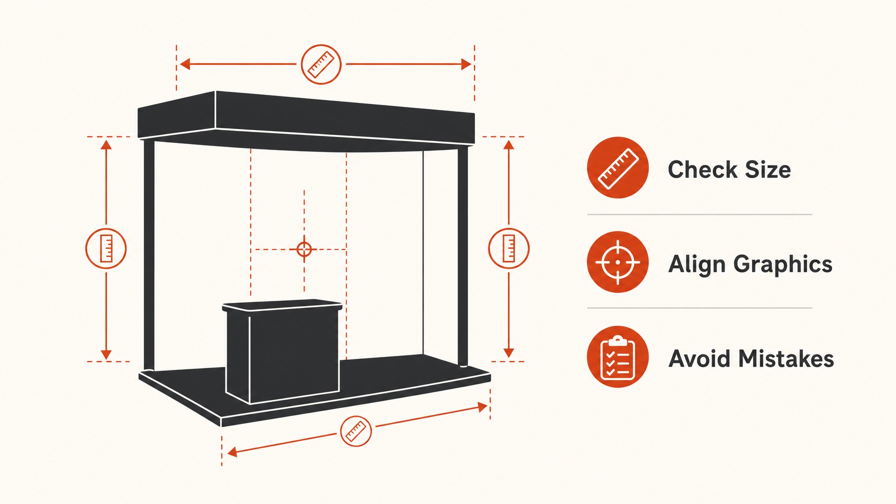
Getting this part wrong could mean an expensive reprint and time lost fixing the issue, not to mention the potential impact on your overall booth presence at the trade show.
One thing most exhibitors end up doing is working closely with the printer or agency responsible for production.
They often provide templates or guidelines, which can save you a lot of hassle when developing your graphics.
If they don’t offer templates, ask for them it’s a simple action that can prevent mismatches.
Another safeguard is maintaining a good relationship with your booth fabricator to confirm the specs they require.
Double-checking with both parties helps make sure that your artwork isn’t just ready for approval but also perfectly suited to the hardware it will adhere to at the event.
What we have seen work really well is using software that allows for precise layout adjustments.
Not all graphic software is created equal, so choose one that offers detailed control over spacing and size options.
You want to trust that what you see on your screen will translate directly into the physical space as planned.
Always review the guidelines provided by the event organizers, as these may differ from past events and even from year to year. Remember, the specifics of verifying dimensions might vary, but the importance of getting them right does not.
4. Maintain Brand Consistency
From what I have seen, the exhibitors that excel at maintaining their brand presence during trade shows often emphasize strict brand consistency across all booth graphics.
This means that every graphic element, color, font, and logo should reflect your brand’s established identity.
What you want is for attendees to instantly recognize your booth simply by its visual cues.
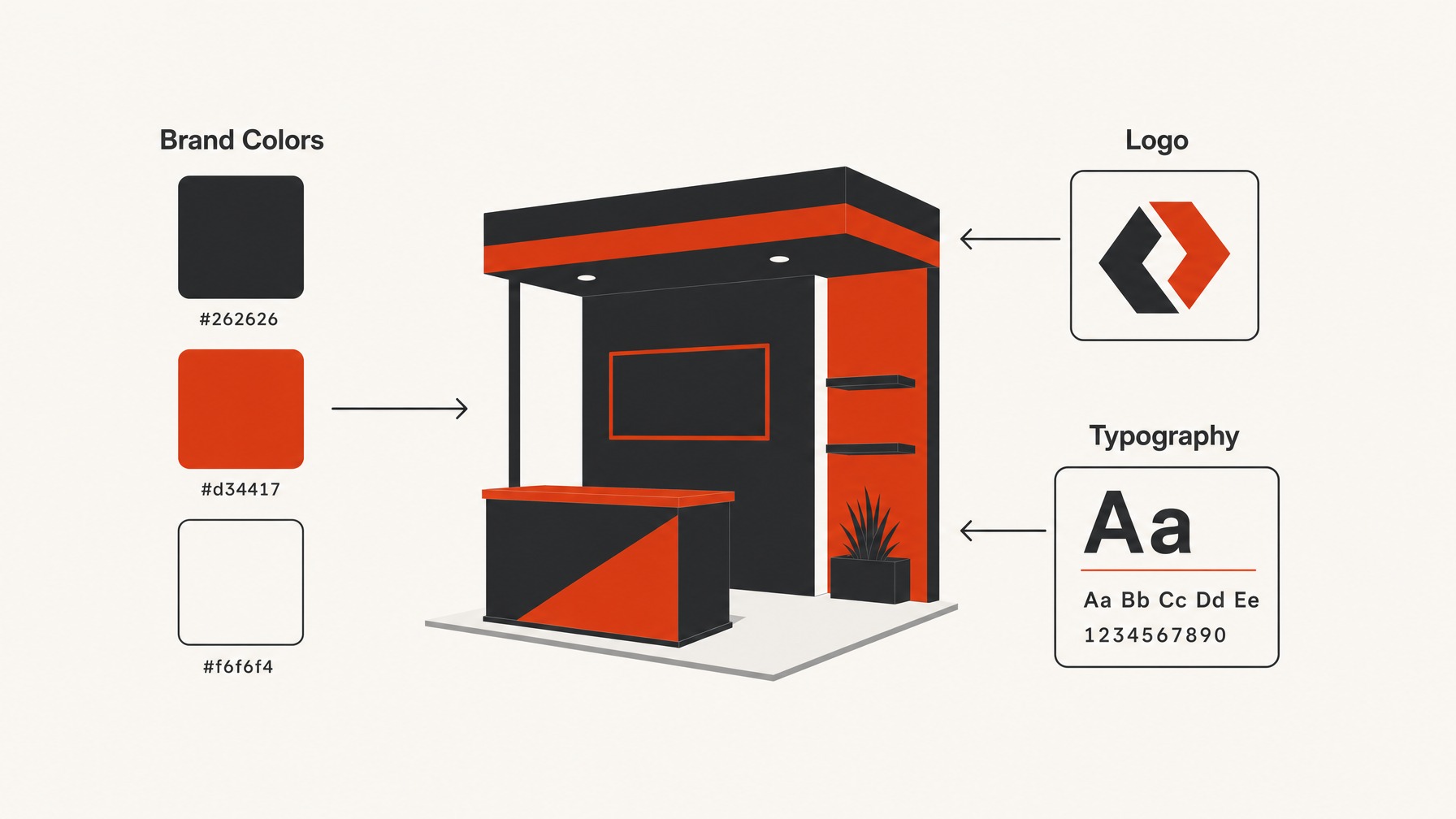
Think about colors and imagery; they should match what’s typically seen in your marketing materials.
The goal here is for every design element to work together seamlessly, reinforcing your overall brand message.
Something that comes up a lot is the temptation to try something completely new or trendy just because it’s available. While innovation is vital, introducing visuals that depart too far from your core branding might confuse attendees rather than attract them.
It’s crucial to strike a balance between fresh design and brand recognition that helps your audience identify and connect with you.
From what others in the industry say, having a clear set of branding guidelines before embarking on the design phase can save time and reduce errors.
One thing most exhibitors end up doing is working closely with both their marketing and design teams to create graphics that reflect their brand’s essence.
Cooperation between teams ensures that final designs aren’t just visually stunning but also aligned with strategic brand goals.
I would say the biggest thing here is making sure that everyone involved in the graphic design process understands and agrees on these branding guidelines.
This step not only enhances consistency but also speeds up the approval process, as less time is needed for revisions.
 Louie J.