
Exhibitant insights

Get practical ideas for your next campaign or show

Join our newsletter for advice on reaching B2B buyers, planning outreach, and getting more from trade shows.

B2B lead generation

Ideas for prospect research, outreach, and follow-up.

Trade show exhibits

Tips for booth design, graphics, and show preparation.

Booth Graphics

4 Essential Tips for Designing Backlit Booth Graphics

Create impactful backlit booth graphics with these key design strategies for enhanced visibility and engagement.

When it comes to exhibiting at trade shows or events, the booth graphics you choose can make a significant impact.

If you’re aiming to capture attention in a bustling environment, backlit booth graphics might be just the solution you need.

Properly designed backlit graphics draw visitors in and make your message shine.

However, designing backlit booth graphics is not just about putting lights behind your existing images or text.

You need to approach this with specific strategies that consider color, materials, and overall readability.

This can make the difference between a striking display and one that fades into the background.

My goal is to guide you in crafting backlit booth graphics that truly stand out. I’ll share insights on choosing impactful colors, selecting the right materials, and prioritizing readability.

Each step is crucial to make sure your booth elegantly combines style and substance.

By the end of our exploration, you will have a clear framework for designing graphics that catch the eye and communicate your message effectively. Let’s explore into the essentials to elevate your booth’s visual appeal to its full potential.

Key Takeaways:
  • Choose high-contrast colors for maximum visibility.
  • Select materials that diffuse light evenly.
  • Prioritize readability with clear fonts.
  • Balance graphic elements to avoid clutter.
  • Test graphics under different lighting conditions.

Selecting the right colors and materials ensures your booth graphics are both vibrant and clear.

Test graphics in various lighting conditions to see how your chosen fonts and elements hold up.

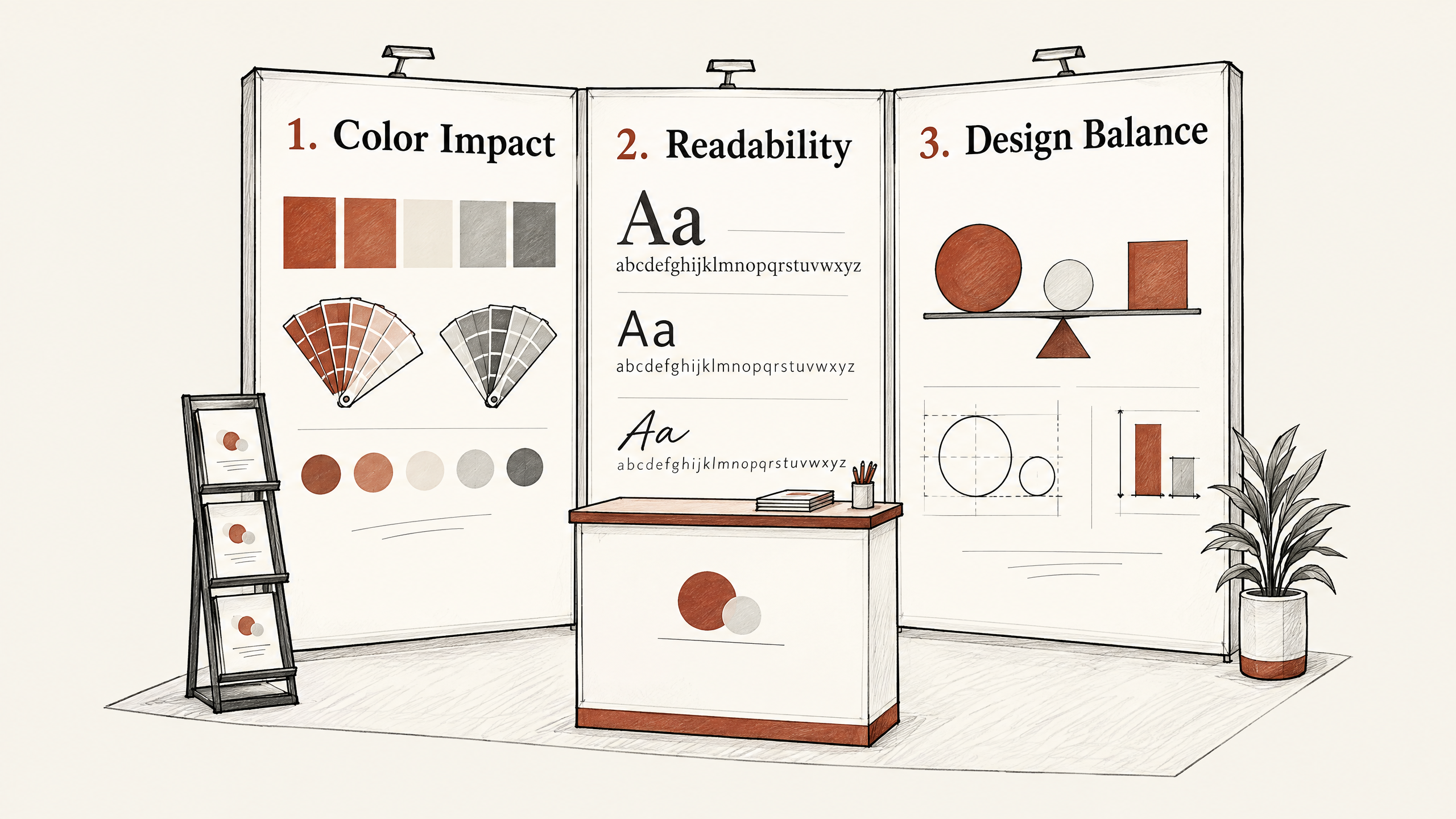
1. Choose the Right Colors for Impact

Choosing the right colors for your backlit booth graphics is crucial for making a strong impression.

Colors not only attract attention, but they can also convey your brand’s message effectively.

Bold, vibrant colors often perform well with backlighting because they can capture the audience’s attention from a distance.
1. Choose the Right Colors for Impact — 4 Essential Tips for Designing Backlit Booth Graphics

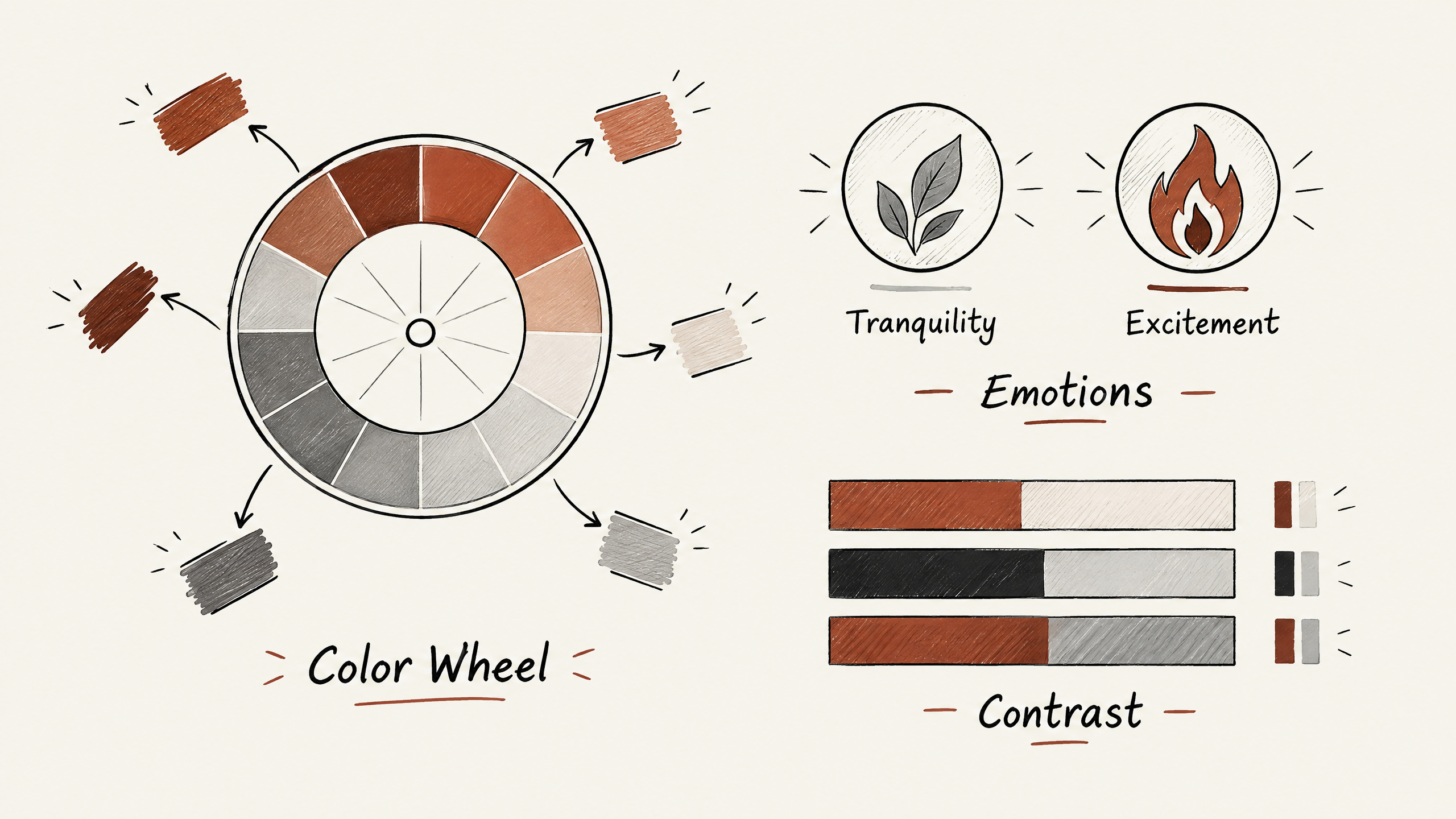
When picking colors, you should think about your brand identity and the emotions you want to evoke in potential clients. For example, green is associated with tranquility and growth, while red can create a sense of urgency and excitement.

Align these colors with your brand’s personality to reinforce your message.

Also, consider contrast as a tool to enhance visibility.

A high contrast between your background and text ensures that your graphics are visible under various lighting conditions. For instance, light text on a dark background or vice versa can make your message stand out beautifully when backlit.

However, be mindful of the overall aesthetic balance.

Too many colors can lead to a visually overwhelming design.

Limit your palette to a few well-chosen colors to maintain a cohesive and professional appearance.

As an example, let’s assume you’re promoting an eco-friendly product.

A color palette with shades of green and earthy tones could reinforce the sustainable aspect of your brand.

In contrast, a tech company might benefit from a blue and white palette to symbolize innovation and reliability.

To wrap it up, pick colors that not only draw eyes but also affirm your brand’s essence.

This will help create a memorable booth that resonates with your audience.

2. Select Materials That Enhance Lighting

Choosing the right materials is essential for making your backlit booth graphics pop and draw attention.

Different materials can either diffuse or block light, affecting the visual impact of your graphics.

The key is to select materials that are tailored to your specific design and lighting goals.
2. Select Materials That Enhance Lighting — 4 Essential Tips for Designing Backlit Booth Graphics

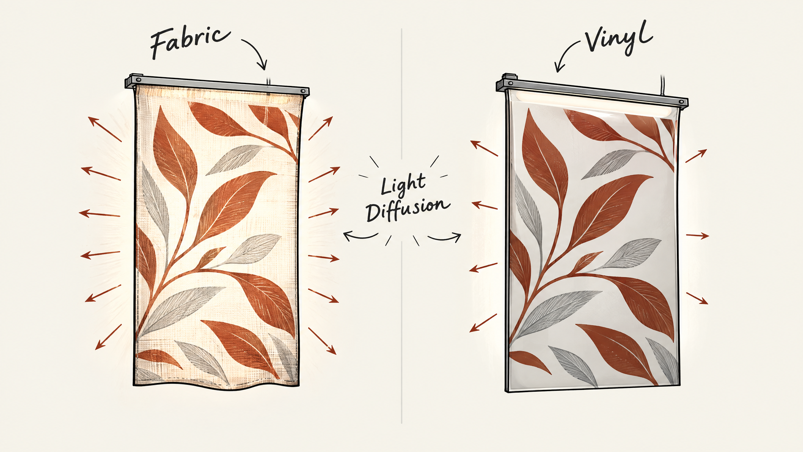
A popular choice is fabric graphics, which are often lighter and easier to transport. Fabrics such as polyester blends work well because they allow light to diffuse evenly.

In contrast, vinyl graphics are more durable but can sometimes appear less vibrant when backlit, as they might not allow light to pass through as effectively. That’s why a blend of polyester is frequently preferred for creating a soft glow.

Finding the right balance also involves considering the lighting source.

LED backlighting is a common option, providing uniform illumination without the heat that traditional bulbs produce.

Pro Tip: Choose polyester blend fabrics for your booth graphics to make sure even light diffusion and a soft glow, enhancing visibility without causing glare or hot spots.

However, if your booth involves close-up interaction, make sure the backlit materials don’t cause glare or hot spots that could obscure the graphics.

A well-lit display needs to be visible from various angles and distances.

Remember to account for material density, as higher density can impact light permeability. Your choice should enhance the graphic without overwhelming it.

You may work with your booth designer or an agency like Exhibitant to evaluate prototype samples under actual lighting conditions.

This helps confirm that the selected materials perform well with your graphic design under show-floor conditions. The focus is always on creating both an eye-catching and functional display.
3. Prioritize Readability and Font Choices

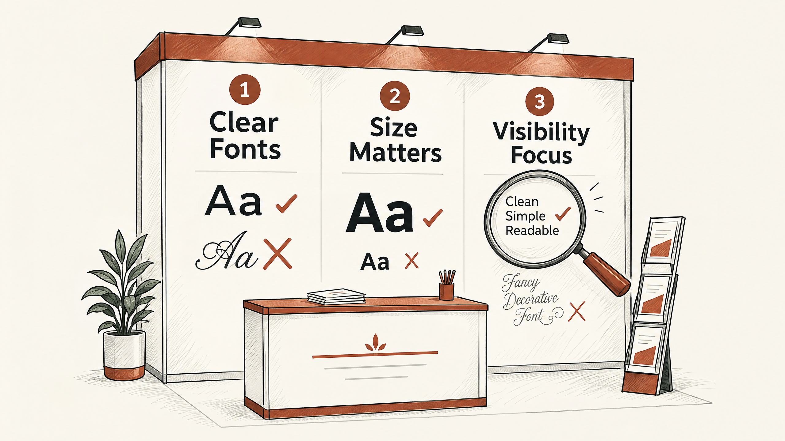
When designing backlit booth graphics, prioritizing readability is crucial. Legible text ensures that attendees easily grasp your message, whether in a busy trade show or a quieter setting.

Choosing the right font can make all the difference in capturing and retaining attention from a distance.

Start by selecting a simple, sans-serif font.

These fonts are often clearer and more readable compared to elaborate serif fonts, especially when backlit.

3. Prioritize Readability and Font Choices — 4 Essential Tips for Designing Backlit Booth Graphics

For example, fonts like Arial, Helvetica, or Open Sans can help maintain clarity and visibility, even from afar.

Avoid overly decorative fonts that may become indistinct when illuminated.

Next, consider font size and weight. make sure the text is large enough to be read clearly from a reasonable distance, typically 15-25 feet away.

The thickness or boldness of a font can also influence legibility under backlighting. A boldweight font may be more effective in standing out than a light-weight option.

Assess the contrast between text and background to enhance readability further.

One common mistake made in booth design is overloading graphics with text. Aim for brevity.

Focus on a clear, concise message to facilitate easier comprehension.

Remember, the goal is to communicate quickly and effectively, not overwhelm with detail.

Test your designs in the intended lighting conditions whenever feasible.

Print a sample of your graphic and backlight it in the space if possible.

This approach can help you identify any issues early on, reducing the risk of surprises at the event.

4. Balance Elements for a Clean Design

Achieving a clean design in your backlit booth graphics is crucial for capturing attention and guiding the viewer’s eye effectively.

A design with balanced elements allows potential customers to absorb your message without feeling overwhelmed. When elements feel cluttered or chaotic, viewers may quickly lose interest, deflecting attention from your product or service.

A well-balanced layout enhances the overall impact of the design.

4. Balance Elements for a Clean Design — 4 Essential Tips for Designing Backlit Booth Graphics

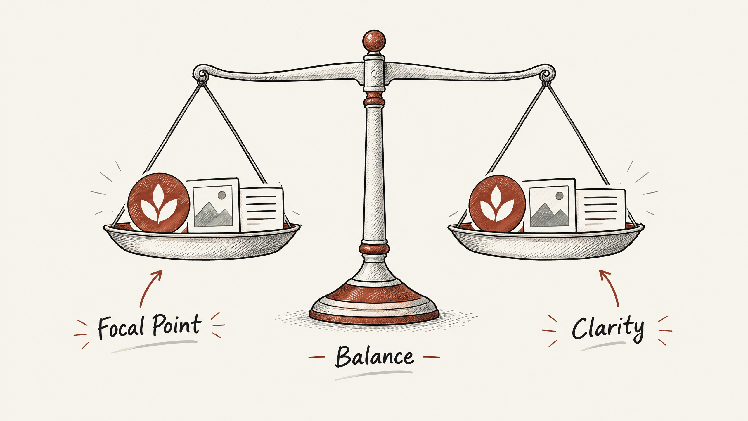
To execute a balanced design, start by organizing your elements according to the principles of visual hierarchy.

This means using size, contrast, and placement strategically to highlight the most critical information. Begin by selecting one focal point, such as your company logo or a key image, and make it prominent.

Place secondary text or images in supporting roles, ensuring they don’t compete with the primary focus.

Using space effectively between elements is key to avoiding a cramped look.

Another approach to maintaining balance is through the thoughtful use of color and symmetry. By repeating certain colors or shapes throughout the graphic, you can create a sense of unity.

Symmetry can provide balance, but asymmetry can also work if planned with intention.

Asymmetrical designs can create dynamic movement, drawing the eye through the content in a purposeful way.

Important: To achieve a balanced design, prioritize simplicity by focusing on key messages and effective use of space to prevent viewer confusion and disengagement.

Choose which approach aligns best with your communication goals.

One common mistake is overloading the design with too much text or too many images, hoping to convey as much information as possible.

This approach often backfires, leading to confusion and disengagement.

Instead, aim for simplicity.

Focus on a few key messages or images that resonate with your audience.

Remember, backlit graphics are meant to intrigue and draw people into your booth for deeper engagement, not convey every detail upfront.

A balanced design helps your rightful elements shine under the spotlight, inviting engagement and inquiry.

Exhibitant‘s exhibit support can assist in refining your booth graphics to connect with potential buyers effectively. To achieve an aesthetic and functional balance, make sure every design choice has a clear purpose, reinforcing your brand and attracting prospects.

What It All Comes Down To

Designing effective backlit booth graphics involves making thoughtful choices about colors, materials, readability, and design balance. Each of these elements plays a crucial role in creating a display that captures attention and communicates your message clearly.

Anchoring your design in these core components ensures that your booth stands out in the crowded trade show environment.

Next, take the insights from each section and start assessing your current booth graphics or the concepts you’re planning.

What It All Comes Down To — 4 Essential Tips for Designing Backlit Booth Graphics

Are the colors going to pop when backlit? Do the fonts maintain readability against the bright illumination?

Your answers will guide adjustments that elevate your graphic design.

Ultimately, keeping a keen eye on these details empowers your team to produce compelling visuals that resonate with your audience.

A well-executed design can enhance engagement, spark conversations, and lead to valuable connections at your next trade event.

Need a booth plan?

Turn show goals into a practical exhibit path

Share your footprint, timeline, and priorities. Our team can help shape the booth direction, graphics, and project support.

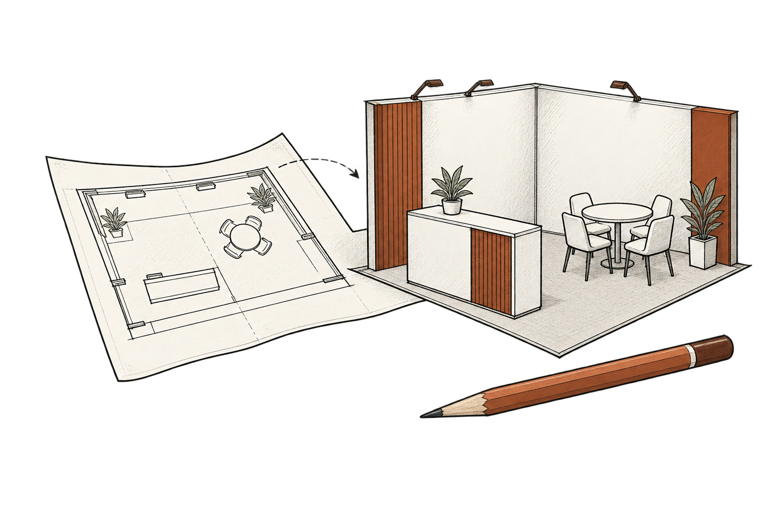
Hand-drawn booth floor plan and exhibit with cedar accents

Contact our team

Tell us who you want to reach

Tell us about your business, the buyers you want to reach, and what you want to achieve. Whether you need more sales conversations, stronger marketing, or a trade show presence, we’ll help you identify where to focus and what support makes sense. Together, we can shape a practical plan around your priorities, budget, and timeline.

info@exhibitant.com

Tell us what you need

A few details will help us make the most of our conversation.