Understanding how to use color in booth graphics can significantly impact how your audience perceives your brand.
Every color generates various emotional responses. By strategically using color psychology, you can create more effective and engaging booth displays.
Here, I will walk you through seven creative methods to enhance your booth graphics through the power of color.
Using colors that align with your brand identity is crucial for delivering a cohesive message.
You want every attendee to recognize and remember what your brand stands for.
The right color scheme can reinforce brand values and make your booth memorable.
It’s not just about choosing colors that look good; it’s about picking those that feel right for your brand.
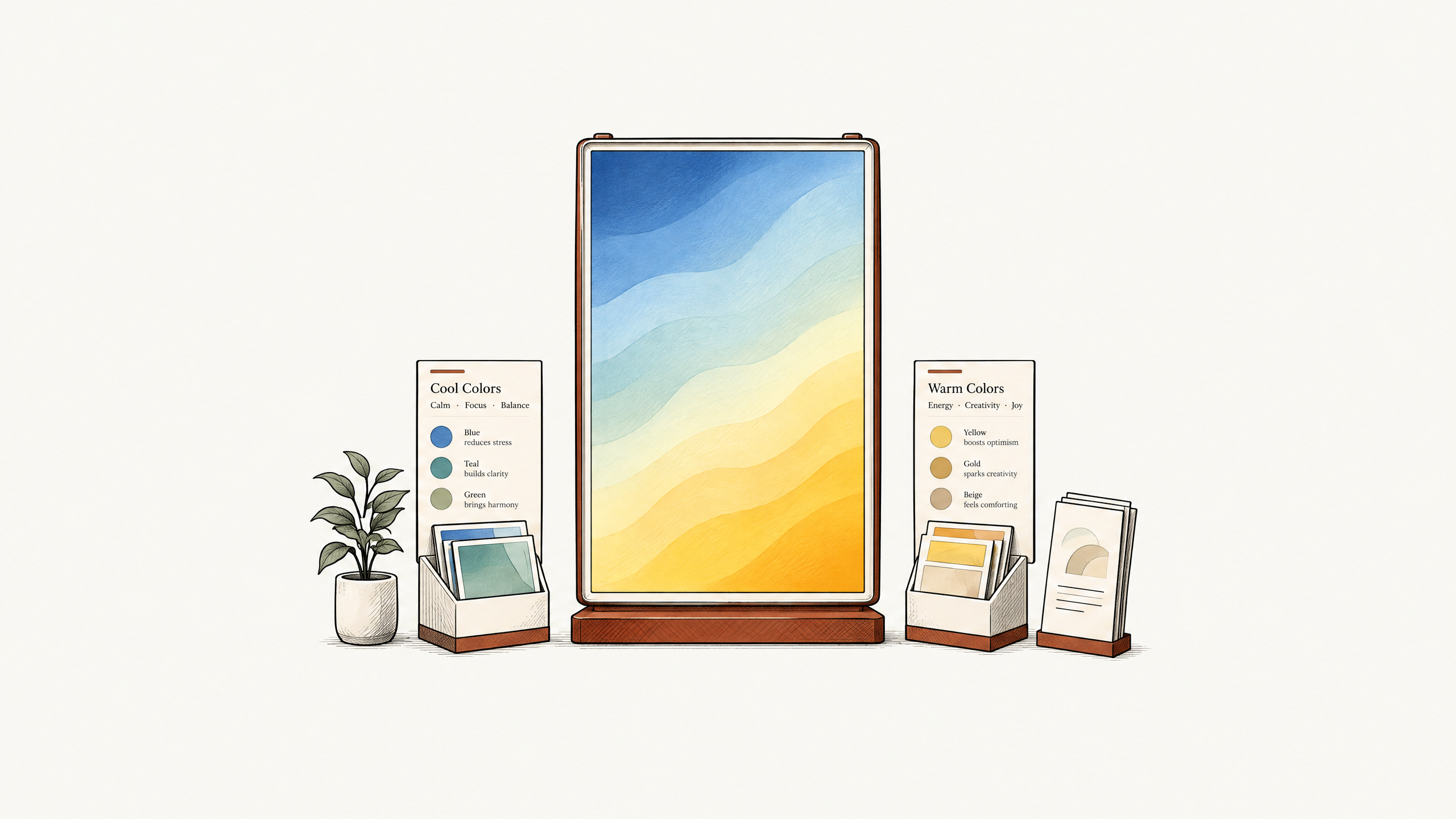
If your goal is to attract attention, using warm colors can be a great way to catch the eye of potential visitors. These colors can evoke a sense of urgency or excitement.
On the other hand, cool colors can help create a calming atmosphere, inviting visitors to spend more time at your booth.
Both strategies have their own advantages, depending on what type of experience you wish to create.
Once you’ve got the colors down, testing combinations for effectiveness is an absolute must.
Color contrast significantly enhances visual impact but testing combinations allows you to see what works best in your specific setting. By the end of this article, you’ll be equipped with the practical strategies to not only design stunning booth graphics but also guide visitor flow intuitively.
Key Takeaways:
Use warm colors to evoke excitement and energy.
Implement cool colors for a calm and trustworthy vibe.
Choose contrasting hues for visual impact.
Leverage brand colors to reinforce identity.
Test color combinations before finalizing designs.
Choosing the right color combinations can make your booth stand out and effectively communicate your brand’s message.
Experiment with different hues and test them to find what resonates best with your audience.
1. Understand the Basics of Color Psychology
The fundamentals of color psychology are a useful tool for designing your booth graphics. This knowledge will help you make strategic choices that enhance your brand’s appeal.
Different colors evoke specific emotions and reactions, which can influence how potential buyers perceive your offerings.
Begin by understanding that colors are more than decorative elements; they are powerful communication tools.
For instance, red can create a sense of urgency or excitement, making it ideal for stimulating action or drawing attention.
Conversely, blue often represents trust and stability, which can benefit industries like finance and healthcare.
Knowing the emotions and perceptions associated with colors allows you to align them with your marketing goals. You could use green to convey sustainability if you focus on eco-friendly products.
Orange might foster a sense of fun and creativity for businesses that thrive on innovation.
Incorporating these principles effectively means more than selecting your favorite hues.
It involves matching your color choices with the message you want to convey. This knowledge ensures that your booth graphics resonate with your target audience, creating a memorable and impactful experience.
2. Align Colors with Brand Identity
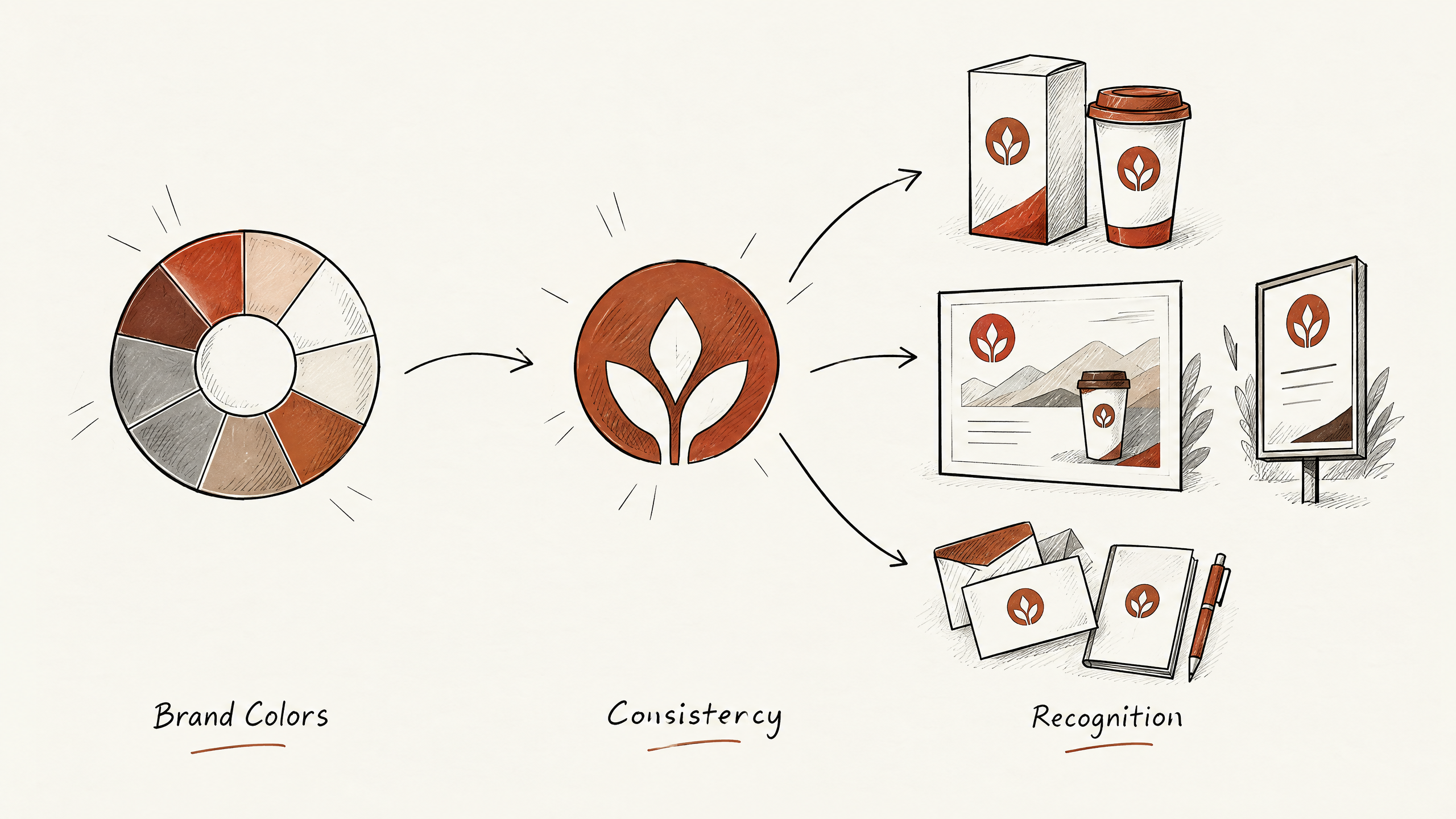
Aligning your booth graphics’ colors with your brand identity is crucial.
It reinforces your brand image and helps attendees easily recognize your company. Colors used in booth graphics should resonate with your existing branding materials, such as logos, packaging, and advertising.
This ensures a consistent consumer experience across all touchpoints.
Consistency fosters familiarity, which can positively impact customer trust and loyalty.
Start by reviewing your brand’s primary colors. Determine which of these will be central to your booth design.
For example, if your brand is associated with a vibrant blue, incorporating this into your booth elements will strengthen brand recognition.
Next, think about your secondary colors and how they can accentuate the primary choice.
Use them selectively to avoid clutter and maintain a cohesive design.
Important: Aligning booth graphics with your brand’s primary and secondary colors ensures consistency, builds familiarity, and positively impacts customer trust and loyalty.
One crucial tradeoff is balancing brand colors with those that evoke the desired emotional response.
If your brand color is green, known for calmness and sustainability, but you want to convey urgency at a trade show, decide how to integrate both moods effectively.
Perhaps by using bold typography or dynamic shapes in your graphics alongside your standard green.
Avoid common mistakes like overloading on one color, which can lead to a monotonous and uninspiring display.
Instead, create a strategic mix of your brand colors to enhance depth and draw attention without straying from your identity.
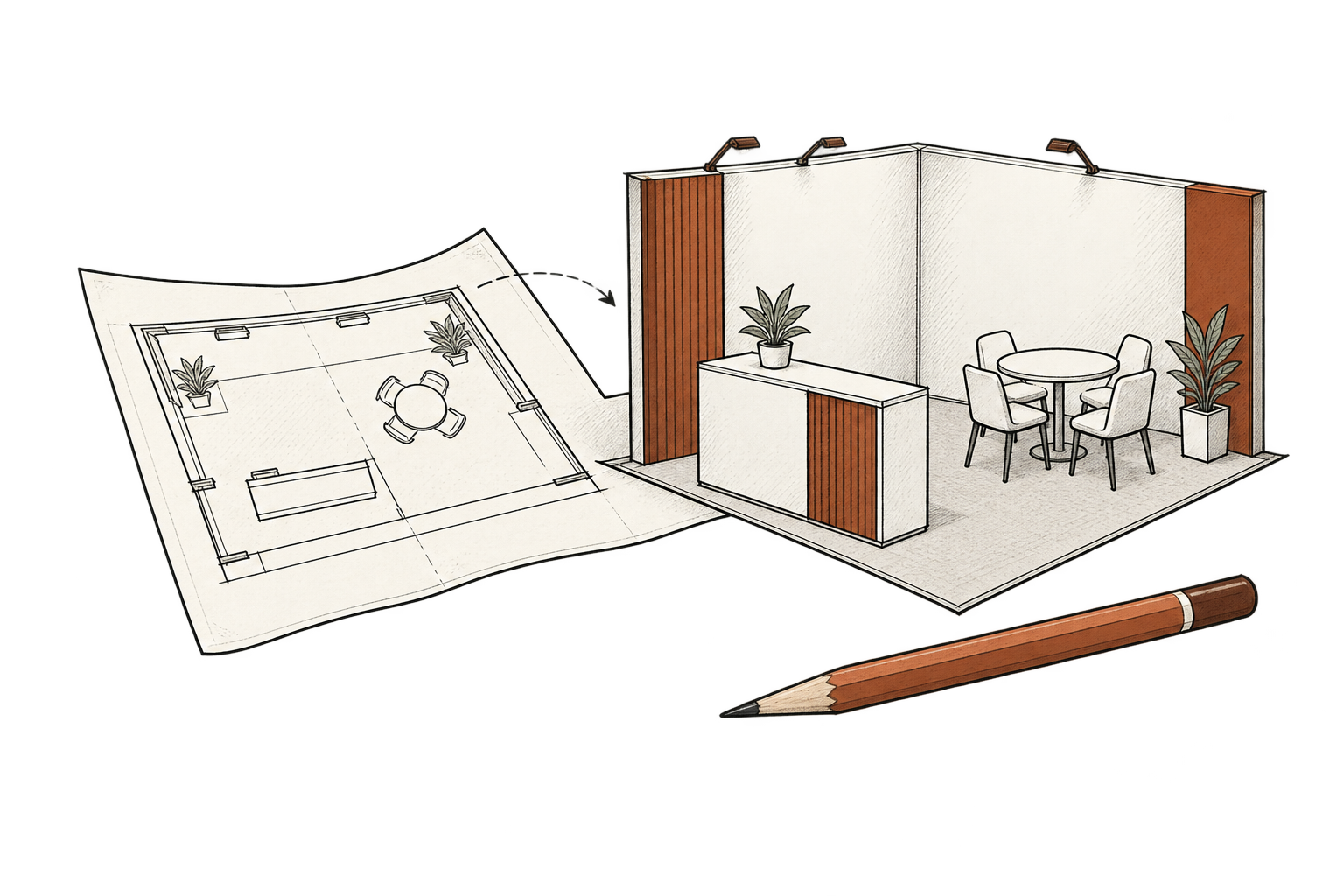
Plan early and test how different color ratios appear in mockups or prototypes before finalizing your booth design.
3. Use Warm Colors to Attract Attention
When designing booth graphics, one effective way to grab interest is by using warm colors.
Shades like red, orange, and yellow are naturally stimulating.
They catch the eye and are often associated with energy and excitement.
This characteristic makes them a valuable tool for drawing visitors to your booth amidst a sea of competition.
Warm colors can do more than just attract; they can also impact emotions and perceptions.
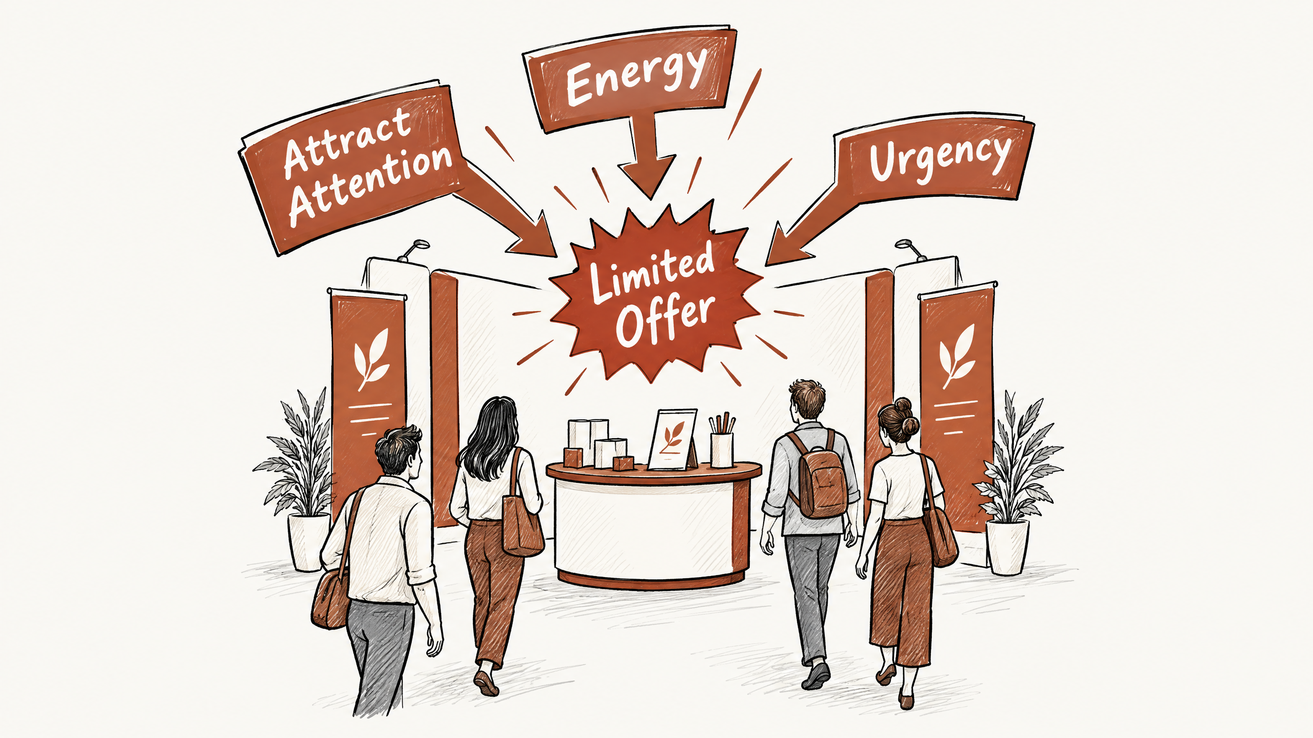
For example, red is commonly linked with urgency and passion, which can be great for promoting a limited-time offer or new product launch.
Alternatively, orange often evokes feelings of friendliness and cheerfulness, making it ideal for engaging and approachable brands.
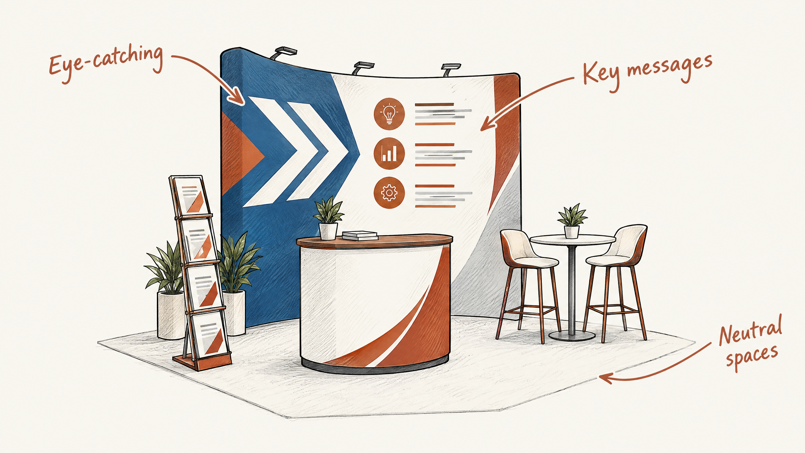
Pro Tip: To effectively use warm colors in your booth design, strategically highlight key areas such as signage or product displays, balancing these hues with neutral tones to maintain visual harmony.
Here is how I would approach using warm colors effectively: Start by pinpointing where you want to grab attention within your booth setup. Whether it’s the main signage, product demos, or interactive displays, focusing on specific areas ensures that the colors work strategically rather than just aesthetically.
Balance these bold hues with neutral tones to avoid overwhelming the viewer.
In terms of logistics, integration of warm colors should involve collaboration between your marketing team and design experts.
At Exhibitant, we assist by conceptualizing booth graphics that use color psychology in a way that aligns with your broader marketing strategy.
By keeping your brand’s target audience and message front and center, you can effectively use the power of warm colors to enhance booth engagement.
4. Use Cool Colors for a Calming Atmosphere
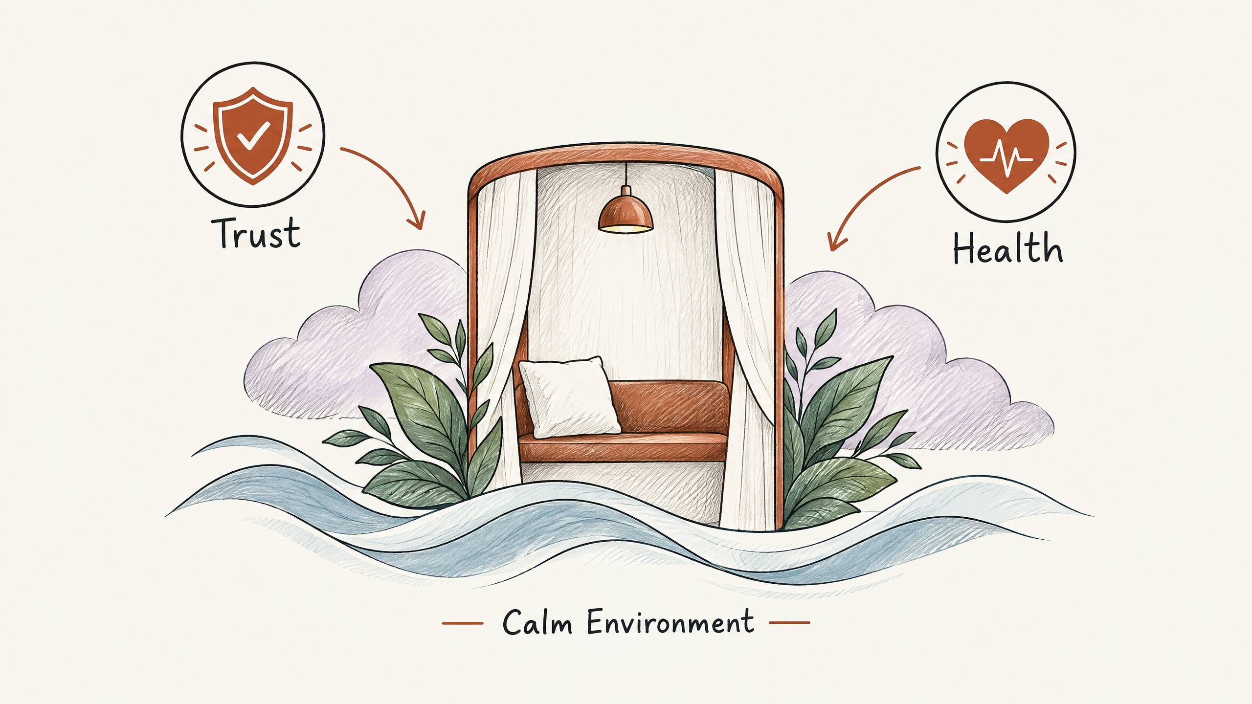
Choosing the right color scheme for your booth graphics can dramatically affect how visitors perceive your brand. When you use cool colors, such as blues, greens, and purples, you invite a sense of relaxation and calmness.
These shades are ideal for businesses aiming to create a soothing environment that encourages attendees to linger and engage.
The use of cool colors is particularly effective in industries like wellness, finance, and healthcare, where building trust and promoting a sense of peace are essential. For example, a trade show booth for a financial advisory service might use a backdrop of soft blue to convey security and reliability.
A healthcare company could layer in greens to enhance perceptions of health and rejuvenation.
However, striking a balance is crucial. Too much cool color can lead to a sense of detachment or coldness, so it’s important to balance these tones with warmer accents or neutrals.
Consider using warmer hues for text or icons to maintain attention without sacrificing the calming atmosphere.
As you plan your booth graphics, draw from nature’s palette: think of calming ocean waves or verdant landscapes.
But remember, the key is to reflect your business’s unique voice while considering the emotional response you wish to evoke in your audience.
5. Create Contrast for Visual Impact
When creating booth graphics, using contrast effectively can enhance visibility and draw attention from afar.
Contrast in colors can create a lively and interesting composition that captures the eye, encouraging potential customers to explore further. In high-traffic trade show environments, a booth that stands out can make all the difference.
To create contrast, pair complementary colors, such as blue and orange, to make elements pop against one another.
This tactic can be used to highlight critical messages or calls to action.
Be mindful not to overdo it; too much contrast can result in a cluttered or confusing look.
A balanced approach that integrates bold elements with neutral spaces can offer the best of both worlds.
Consider a hypothetical scenario where your company, selling innovative tech solutions, chooses a deep blue background for the primary booth graphics. Adding vivid yellow text or icons will highlight essential information and attract potential clients.
Such use of contrast can effectively distinguish your brand’s message from the surrounding competition.
Contrast must be thoughtfully planned with an eye toward both aesthetic value and user-friendly design.
A common mistake is using contrast without considering how the colors will appear in varied lighting conditions within the exhibition hall.
For advice on perfecting these techniques, Exhibitant provides expert consultation on booth graphics and exhibit design to make sure your display maximizes visual impact.
6. Test Color Combinations for Effectiveness
Testing different color combinations can significantly improve the impact of your booth graphics.
A color scheme that looks enticing in theory may not have the same effect in the chaos of a trade show.
Conducting tests allows you to see how colors interact and adjust accordingly.
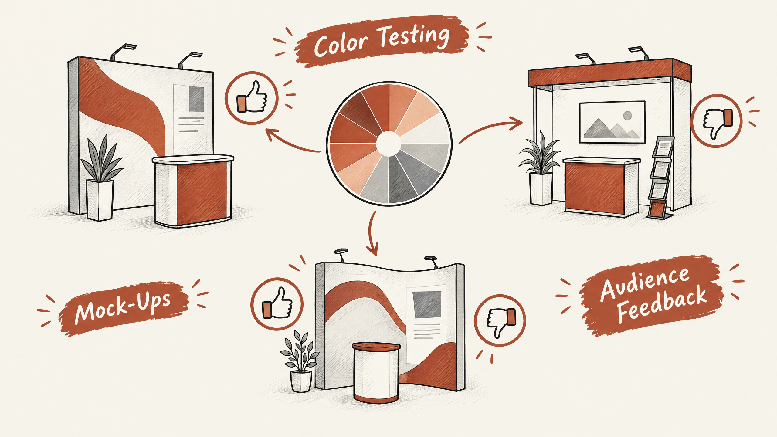
Begin by selecting a few promising color palettes that align with your brand. Create mock-ups of your booth displays using these combinations.
This step will help you visualize whether the colors maintain their intended emotions and functionality when used together.
A/B testing is another valuable approach.
Present different color schemes to a segment of your audience before the event.
Collect feedback on which combination captures attention and conveys the message most effectively. This data-driven method reduces guessing and increases the likelihood of success.
When testing, consider factors such as lighting conditions at the venue.
Important: make sure your text remains legible against the background colors, as readability is crucial for clear communication in busy trade show environments.
Colors can appear differently under artificial lights compared to natural daylight. Conducting tests in settings that simulate trade show conditions will give a more realistic picture of the display’s impact.
A common mistake is focusing too much on aesthetics while ignoring readability. make sure that text remains easily legible against your chosen background colors.
This enhances usability as it ensures your messaging is clear to attendees.
As an example, imagine testing combinations for a tech company’s booth.
Perhaps one palette uses bold blues with sharp whites, while another mixes vibrant greens with subtle grays. Each carries distinct connotations but might serve different purposes.
Testing these in practical conditions reveals which one communicates innovation more compellingly, guiding your choice for the final design.
7. Use Color to Guide Visitor Flow
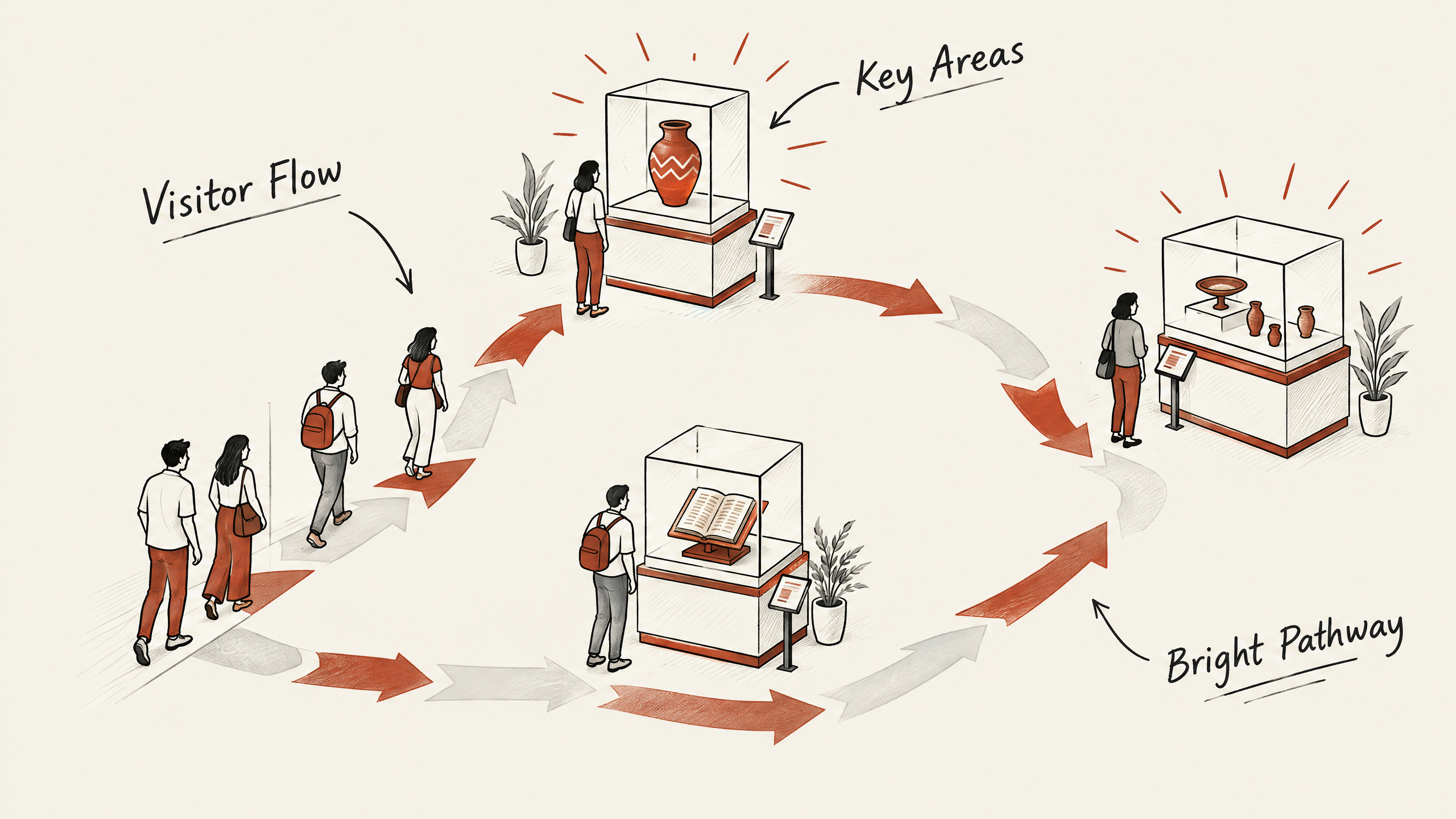
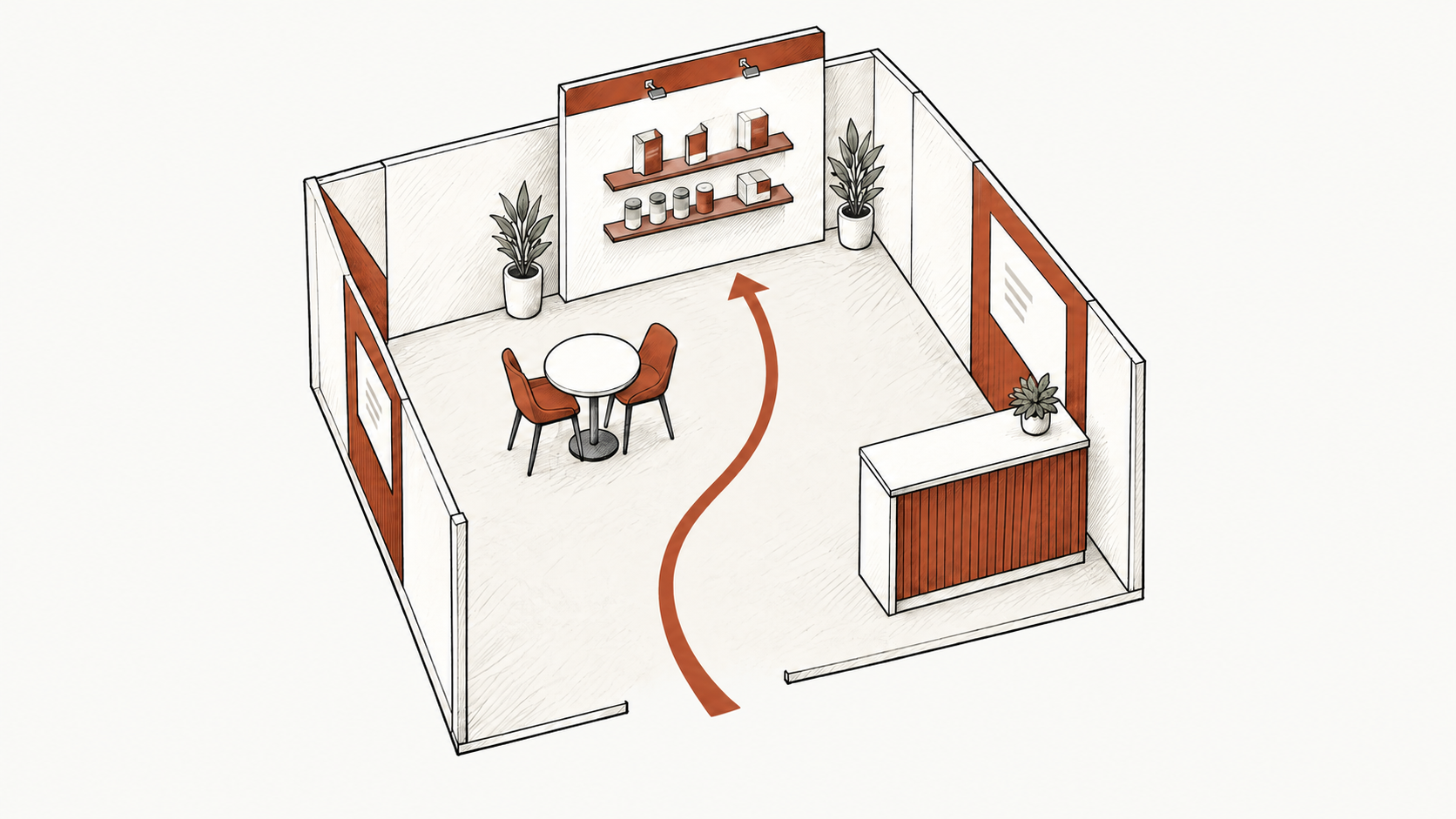
Strategically using color in your booth graphics can subtly guide visitor flow and enhance the overall experience. One effective tactic is to create a visual pathway that leads guests to key areas of interest within your booth, such as product displays or demonstration zones.
This approach not only helps manage foot traffic but also ensures that attendees do not miss the most critical elements of your exhibit.
To guide flow, consider using brighter or more vivid hues to highlight the pathways or entry points to important sections.
These vivid colors naturally draw the eye and encourage movement toward them, making it easier to direct traffic within your space.
For example, if the goal is to bring visitors to a new product show, use bright colors on the flooring or along the walls that lead to the dedicated space.
It is essential to balance these attention-grabbing colors with complementary shades that won’t overwhelm visitors.
Pro Tip: Use bright colors strategically on paths or entry points in your booth to naturally draw visitors toward key areas like product displays or demonstration zones.
Overusing vibrant colors can lead to visual fatigue or confusion, disrupting the intended flow. Choose colors that align with your brand and make sure coherence throughout the booth.
By maintaining this balance, you keep the focus on desired interaction points without causing disorientation.
A successful color-guiding strategy can make a significant difference in how visitors experience your booth.
Try implementing designated zones with clear color cues to encourage visitors to interact with you exactly as you plan. By controlling the visual journey, your booth can more efficiently achieve its objectives, whether those are engaging prospects or showcasing new products.
Before You Go
Now that you’ve explored these creative ways to use color psychology in booth graphics, it’s time to apply this knowledge. Each step in choosing your colors can shape visitor experiences and influence their perceptions of your brand.
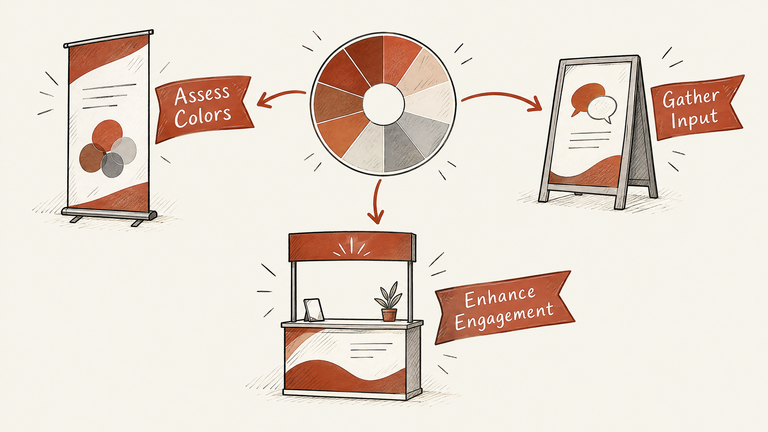
Your next task is to review your existing designs and assess whether adjustments are needed. Consider how each color choice aligns with the emotions and messages you want to convey.
As you plan your booth graphics, involve your design team and gather input on potential color changes. Test various combinations in your next project to determine what best captures attention and enhances visitor engagement.
By consciously incorporating color psychology into your booth graphics, you’re taking a proactive step toward creating a memorable and effective presence at your next trade show.
Embrace these concepts, and you’ll be better equipped to leave a lasting impression.
Need a booth plan?
Turn show goals into a practical exhibit path
Share your footprint, timeline, and priorities. Our team can help shape the booth direction, graphics, and project support.
Keep planning
More exhibit guidance
Keep exploring practical advice on booth planning, marketing, and getting more from your next show.
Tell us about your business, the buyers you want to reach, and what you want to achieve. Whether you need more sales conversations, stronger marketing, or a trade show presence, we’ll help you identify where to focus and what support makes sense. Together, we can shape a practical plan around your priorities, budget, and timeline.
 Louie J.
 Lorena G.